Dental Bliss
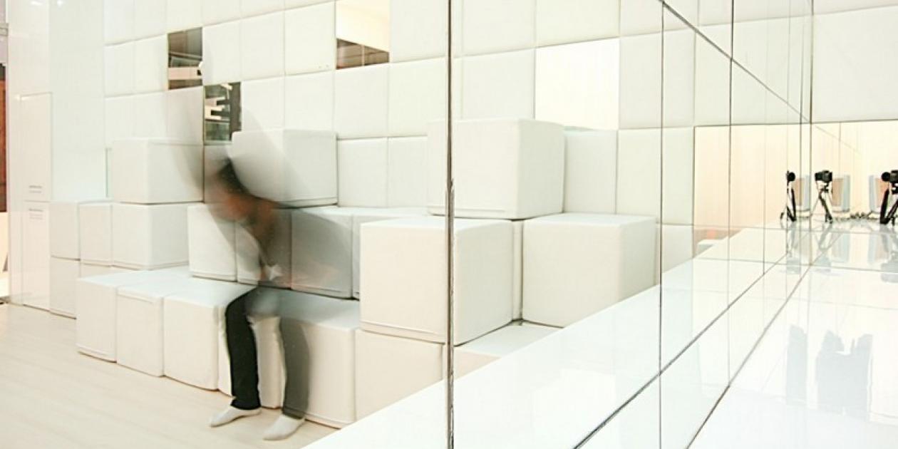
Normally, clinic is definitely not one of a destination to be thought of, except for the time of sickness or unwell. But to care more about your health and have it checked up from time to time won`t be such a bad idea. Therefore, this dental clinic, Dental Bliss, was meant to create the feeling of relaxation and warmth to lessen visitor`s stress from spending time in the small space with strangers and make it feel ordinary to go to clinic by routine.
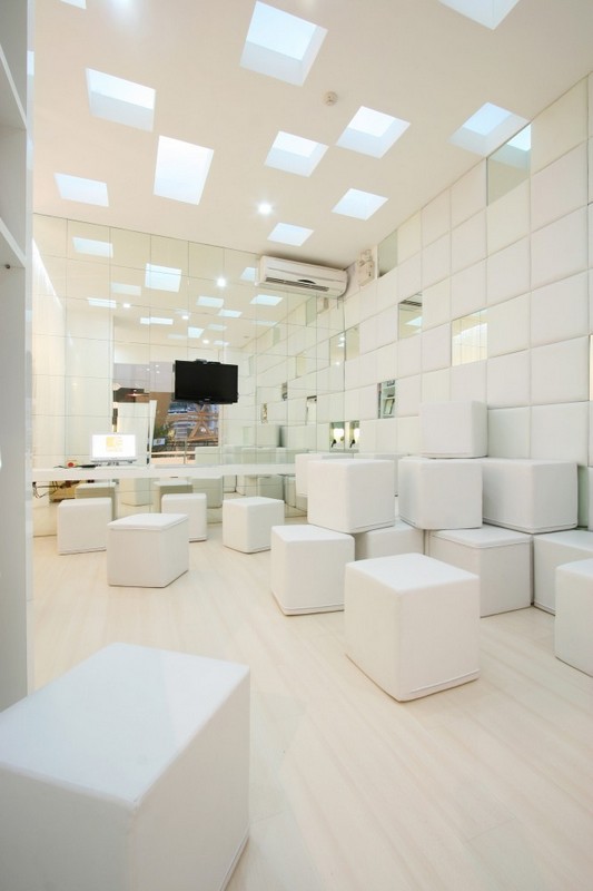
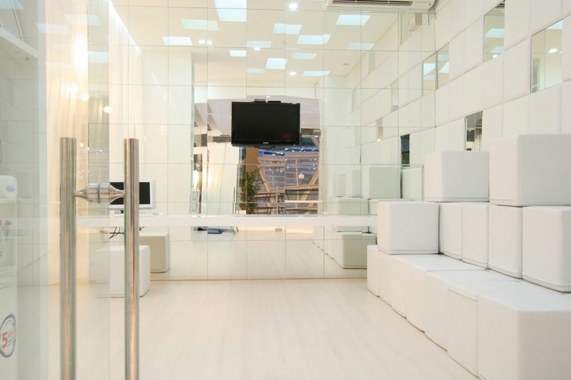
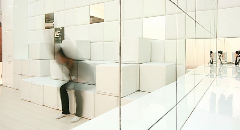
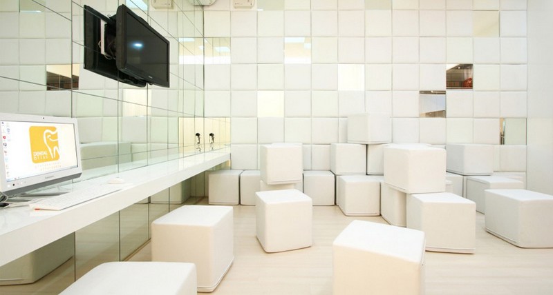
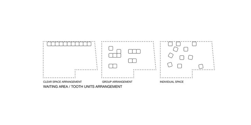
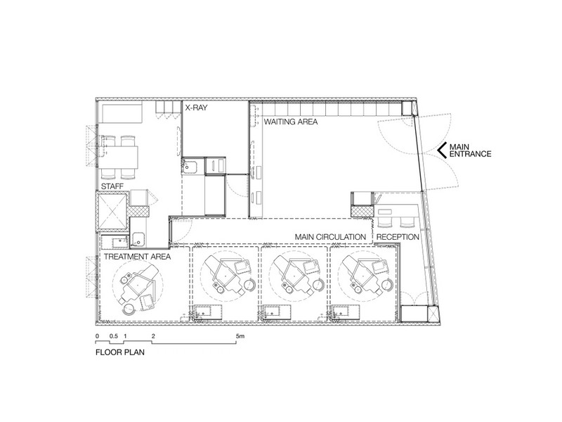
&][8203;According to the basic idea mentioned above, Integrated Field proposed the planning that would give the waiting area a good quality of relaxation and warmth but still have the feeling of privacy, the space that is in between the formalityand informality. The seating in the waiting area which we called the "Tooth Unit" was designed to be the main character of this dental clinic. They are 45x45x45cm cubes enveloped with white leather and mixed in 2 different shades of white. Their light weight made them easy to be flipped or moved around and create one`s own seating space as one like such as private seating or casual bed.
Furthermore, the whole set could be moved aside to create an opening plan for a small event or internal seminar, and the cleaning purpose as well.
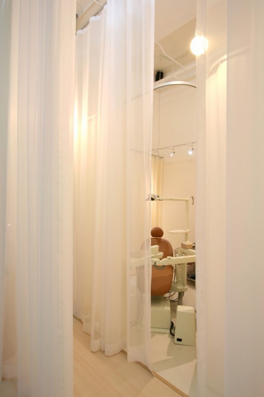
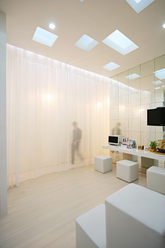
Another main area of this clinic is the open plan treatment area. Each room was defined by a white curtain for the dentist`s convenience in working from room to room. The space usage can be adjust due to different situtations since the dental chairs won`t be at it full number in the early stage. These white curtains also create the feeling of comfort for the patients, and could be easily removed for cleaning. They can be changed in term of color, texture, or opacity when interior mood needed to be changed. The only area in this clinic that is separated by the brick walls was the X-ray area, to protect other areas from the radiation, and were carefully controlled about the standard and quality.
The color scheme and lighting design are based on its corporate identity, color white and orange. Most area were painted in bright white and only use orange to accent some important parts like the front label or dental chairs. The lighting design helps defining the waiting and treatment area by using cool white and warm white light respectively.
Galería de imágenes:


Galería de planos:


Para poder escribir un comentario debe iniciar sesión o darse de alta en el portal.


